
Conversion • 7 min read
The 12-Point Clinic Website Conversion Checklist
Many clinic homepages are built to look professional rather than to convert. Here are twelve things a homepage should make easy to find, and a quick way to check yours.
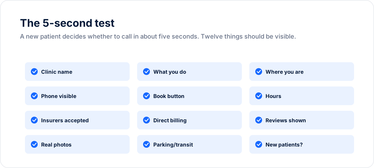
The 5-second test
Try this as an exercise: look at your homepage the way a first-time visitor would, glancing for a few seconds, or ask someone unfamiliar with your clinic to do it. Three things should be clear almost immediately: what you do, where you are, and how to take the next step (book or call). If those three are not obvious at a glance, that is the first thing to fix. The remaining items on this list, the phone number, hours, insurance carriers, direct billing, reviews or a rating, real photos, parking or transit, and accepting-new-patients status, should be easy to find as the visitor scans down the page, not necessarily all in the first glance. For the reasoning behind each element, see how patients choose a clinic.
If any of these are missing or buried, a visitor may move to the next clinic on Google. The rest of this post works through all twelve, grouped the way patients evaluate them, with a specific standard for each.
Points 1-3: name, what you do, where you are
Your clinic name, your service, and your location should be readable in the hero without scrolling: “North York Dental Centre. Family and cosmetic dentistry in North York.” It sounds obvious, but many clinic homepages lead with a slogan and make the visitor hunt for what and where.
Location specificity matters doubly because it is also a local SEO signal: the neighbourhood name in your H1 and opening copy helps the page match the searches patients actually type. Write for the patient first, but know the engine is reading the same sentence.
Points 4-6: phone, hours, accepting-new-patients
Phone number: visible in the header on every page, tap-to-call on mobile. Many patients still call rather than book online, and a number behind a contact-page click is easy to miss. Hours: in the header or footer of every page, accurate, including holiday exceptions, and matching your Google Business Profile exactly, because mismatches erode trust in both.
Accepting-new-patients status: state it explicitly (“Now accepting new patients”). Patients coming from a Google search do not know, and the absence of the statement can read as a probable no. If you have capacity, saying so is one of the simplest changes on this list.
Points 7-8: insurance carriers and direct billing
List the carriers you bill, by name, with logos if you have them. Patients scan for their own insurer, and finding it helps answer the cost question early. Only list carriers you actually work with, since this is a factual claim about your clinic.
Then say the words “we direct-bill your insurance”, in the hero if you can, and certainly above the fold. As covered in our direct billing guide, stating this prominently helps answer a patient's cost question before booking, though a patient's actual eligibility still needs verifying. Repeat it in an FAQ block answering “do you accept my insurance?”, which helps patients understand your billing arrangements (for how AI tools use this kind of content, see our note on AI search for local clinics).
Points 9-10: reviews and real photos
Where your college's advertising rules permit it, show recent reviews or a rating summary near the top, for example “4.9 from 312 Google reviews” with two or three short excerpts. Social proof is a trust shortcut for patients who know nothing about you. This is a genuine constraint, not a formality: some Ontario colleges restrict or prohibit testimonials for their registrants, so confirm what your profession permits before featuring any review content, and see our reviews strategy for the compliant approach.
Photos: real ones. Your actual reception, treatment rooms, and team. Avoid stock photography: visitors often recognize it, and it can read as generic or concealing. Use a genuine, well-lit photo of your own space rather than stock images of models in lab coats.
Points 11-12: parking, transit, and the booking button
Parking and transit: one line, “Free parking behind the building” or “Two minutes from Finch Station.” It is a small practical anxiety that can influence clinic choice in dense GTA neighbourhoods, and answering it costs a sentence.
The booking button: visible without scrolling, on every page, in a colour that stands out from your design system. The label should describe the actual next step. If the button books an appointment directly, “Book Online” is honest; if it opens a form that your staff follow up on to confirm, say “Request an appointment.” Do not label a request form as a booking. Keep the flow short; each additional form field adds friction. The booking button is where a visit turns into an appointment, so make it easy to find and easy to use.
Test the booking path on a phone
Many patients reach your booking flow on a phone. Rather than assume a specific split, check your own analytics (GA4 shows the mobile share of your traffic), then make sure that path works. Test the flow on an actual phone, not a resized browser: tap every button, fill every field, and complete the process from search result to booking confirmation. If your booking system embeds a third-party widget (Calendly, Jane App, Cliniko), test that embed on mobile specifically. A practical test: ask three people who do not know your website to book on their phone, and fix whatever trips them up.
The hero section, assembled
Put together, your hero should answer five questions in fewer words than a tweet: who are you, what do you do, where are you, do you take my insurance, and how do I book. Example: “North York Dental Centre, family dentistry in North York. We direct-bill major insurers. Same-week appointments. [Book Online].” One real photo behind it. That is the entire hero.
Replace whatever tagline currently occupies that space. “Compassionate care since 2008” answers none of the five questions; the example above answers all of them.
Score yourself, then fix in order
Open your homepage on your phone. Check service, location and next step at a glance. Then review the remaining items across the page. Fix in this order: booking button, direct billing statement, carrier list, accepting-new-patients line, real photos, then the rest. That puts the most visible booking and billing elements first, and none of it requires a rebuild, only a homepage rewrite.
If you would like a second pair of eyes, send your URL through the contact page and we will review your homepage against this checklist.
Sources
Google Analytics 4, device and technology reports (to find your own mobile traffic share): support.google.com/analytics/answer/9333790
Frequently asked questions
Want a specific read on your clinic?
Send your clinic URL and we will record a free Clinic Growth Score - three things to fix this week, specific to your practice. No pitch in the video.